12 App Store Screenshot Best Practices That Boost Conversions
Samer Alatawneh · Founder of Storeshot
Your App Store screenshots are the highest-leverage conversion surface you own. They appear in search results, on your product page, and in ads — and small design choices swing install rates by double digits. Apple's own data backs this up: the majority of installs happen directly from search results, where your first two screenshots and your title are effectively your entire pitch.
I'm Samer, founder of Storeshot. I shipped my own apps before building a screenshot tool, and since launch I've watched more than 550 screenshots get generated through it — which means I've seen the same handful of mistakes and the same handful of wins repeat across categories. Below are the twelve App Store screenshot best practices that actually matter, ordered roughly by impact, with the reasoning behind each so you can adapt them instead of copying them blindly. Every principle applies whether you design by hand or use an app store screenshot generator — I'll note where generation speeds the work.
Best practices 1–3: win the search result
- Front-load your best frame. Only the first two screenshots show without scrolling on a phone search result. They carry roughly 80% of the work — lead with your strongest screen and sharpest headline. The practical test: if you could only keep one screenshot, which would it be? That one goes first. If your current first frame is an onboarding screen, a permissions explainer, or a settings page — and we see all three regularly in raw uploads — you're spending your most valuable slot on your least persuasive content.
- Lead with the benefit, not the feature. “Plan a week of meals in 5 minutes” converts better than “Meal planner.” The difference is who the sentence is about: a feature describes your software, a benefit describes the user's life after installing it. A simple rewrite exercise — take every headline in your set and ask “so what?” until the answer is something a user would say out loud — fixes most weak copy in one pass.
- Show the actual app. Skip the logo splash. People scrolling past want to see what the product looks like and does — show real UI with a headline over it. This is also a trust signal: a listing that hides its interface behind illustrations reads as if the interface isn't worth showing. The exception that proves the rule is games, where key art outperforms raw UI — but even there, actual gameplay belongs by frame two.
Best practices 4–6: design for the thumbnail
- Make text readable at ~80px wide. That's roughly how wide a search-result thumbnail renders. The check takes ten seconds: zoom your design out to 100×200 pixels, or step three meters back from your monitor. If the headline disappears, it's decorative, not functional. This single test explains why so many beautiful Dribbble-style screenshot sets underperform plain ones — they were designed at 100% zoom for other designers, not at thumbnail size for browsers.
- One message per screenshot. Each frame should make a single point. Cramming multiple features dilutes all of them — three callout arrows on one screen means the viewer reads none. If a feature deserves mention, it deserves its own frame; if it doesn't deserve its own frame, it doesn't deserve a callout either.
- Keep headlines short. Six words or fewer. Long sentences get truncated by the frame, ignored by the reader, and — if you localize later — overflow in German and Finnish, which run 30–40% longer than English. Writing short from the start is cheaper than redesigning for every language.
Best practices 7–9: build a cohesive set
- Use one palette across all frames. A consistent color story reads as a single confident brand; mismatched designs read as amateur. Two or three colors are enough, and the safest source is your app icon — the icon sits next to your screenshots in every search result, so a palette pulled from it makes the whole listing feel engineered. This is, for what it's worth, exactly how Storeshot plans a set internally: palette first, frames second.
- Pick one type system and stick to it. Same font family, same headline weight, same alignment and position on every frame. When the type jumps between sizes and positions, each frame has to be re-read from scratch; when it doesn't, the viewer's eye knows exactly where to look and swiping through the set feels effortless. Consistency is what separates “designed” from “assembled.”
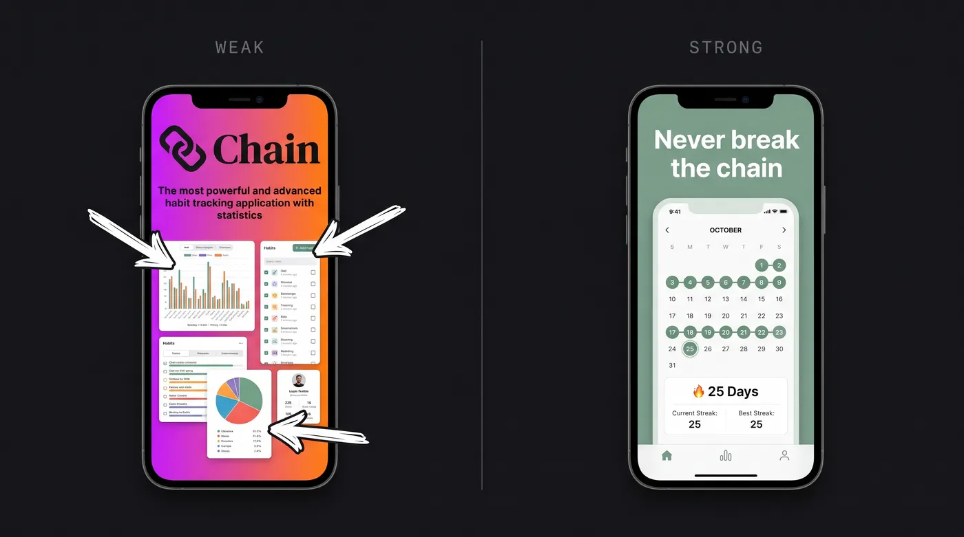
- Tell a story in order. Frame 1 hooks, frames 2–4 prove the value, the last frame can push the call to action. For a habit tracker that might be: the streak screen (“Never break the chain”), the one-tap log (“Log a habit in one tap”), the stats view (“See a month at a glance”), the reminders screen (“Nudges that actually work”). Each frame stands alone for searchers, and reads as a sequence for product-page visitors — both audiences see the same set.
Best practices 10–12: localize, test, refresh
The first nine are design decisions you make once. The last three are an ongoing practice — measuring and improving the set after it ships — covered end-to-end in the screenshot optimization guide. In brief:
- Localize the screenshot copy, not just the description. Translated headlines are one of the biggest under-used conversion wins in international markets — start with your top two or three storefronts by traffic, not all of them at once.
- A/B test in pairs. Both stores give you free experimentation — Apple's Product Page Optimization and Google's store listing experiments — so change one variable per test and let it run a full week before you trust the result.
- Refresh seasonally. Screenshots aren't set-and-forget: update them for new features and seasonal hooks (fitness apps in January, shopping apps before the holidays), and whenever a test produces a clear winner. A set that no longer matches the app quietly costs you in early uninstalls.
Common mistakes we keep seeing
These come straight from reviewing raw screens and generated sets — the failure modes that repeat across categories:
- Tiny, unreadable headline text. The #1 issue by volume. Designed at desktop zoom, never checked at thumbnail size.
- Empty or placeholder content in the UI. Roughly one in five raw screens uploaded to Storeshot shows blank lists, default avatars, or test data. A polished frame around a lifeless screen still converts poorly.
- Inconsistent status bars across the set. Different times and battery levels frame to frame. Freeze them (9:41, full battery) or hide them.
- Device frames that don't match the real device. A 6.9-inch screen inside an iPhone 8 bezel looks broken to anyone who owns the phone.
- Overdesigned backgrounds. Heavy gradients, particle effects, and extreme 3D angles age badly and bury the UI. Calm backgrounds hold up.
- A logo or value-prop card as frame one. Your most valuable slot, spent on the only content that contains zero evidence.
- Maxing out all 10 slots out of obligation. Sets of 4–6 deliberate frames consistently look stronger than 10 padded ones. Settings screens and edge-case features dilute the story.
Putting it together
If you only act on three things: put your strongest frame first, write benefit-led headlines you can read at thumbnail size, and make the set cohesive in palette and type. Those three carry most of the conversion impact; the rest is compounding refinement.
For the exact pixel sizes behind all of this, see the 2026 screenshot size guide, and for the end-to-end workflow from raw capture to upload, see how to make App Store screenshots. When the set is live, the screenshot optimization guide covers measuring and A/B testing it.
Best practices, built in
Storeshot composes a cohesive set with a planned palette, readable headlines, and consistent typography — at the correct dimensions for every device. Your first three are free.
Generate screenshots →Last updated June 2026.