How to Make App Store Screenshots (Step-by-Step, 2026)

Samer Alatawneh · Founder of Storeshot
App Store screenshots are the single most important visual asset in your listing — more people see them than ever install your app, and on a phone search result they decide whether someone taps “Get” or keeps scrolling. Yet most developers treat them as an afterthought: a raw simulator capture, uploaded at the last minute.
I'm Samer, the founder of Storeshot. Before building it I shipped my own apps — including Flag Quiz 3D, whose screenshots you can see redesigned on our homepage showcase — and made every mistake in this guide at least once. Since launch, more than 550 screenshots have been generated through Storeshot, and reviewing the raw screens people upload has taught me more about where listings go wrong than any ASO article ever did. This guide walks through how to make App Store screenshots properly, step by step, whether you do it by hand or with an app store screenshot generator.
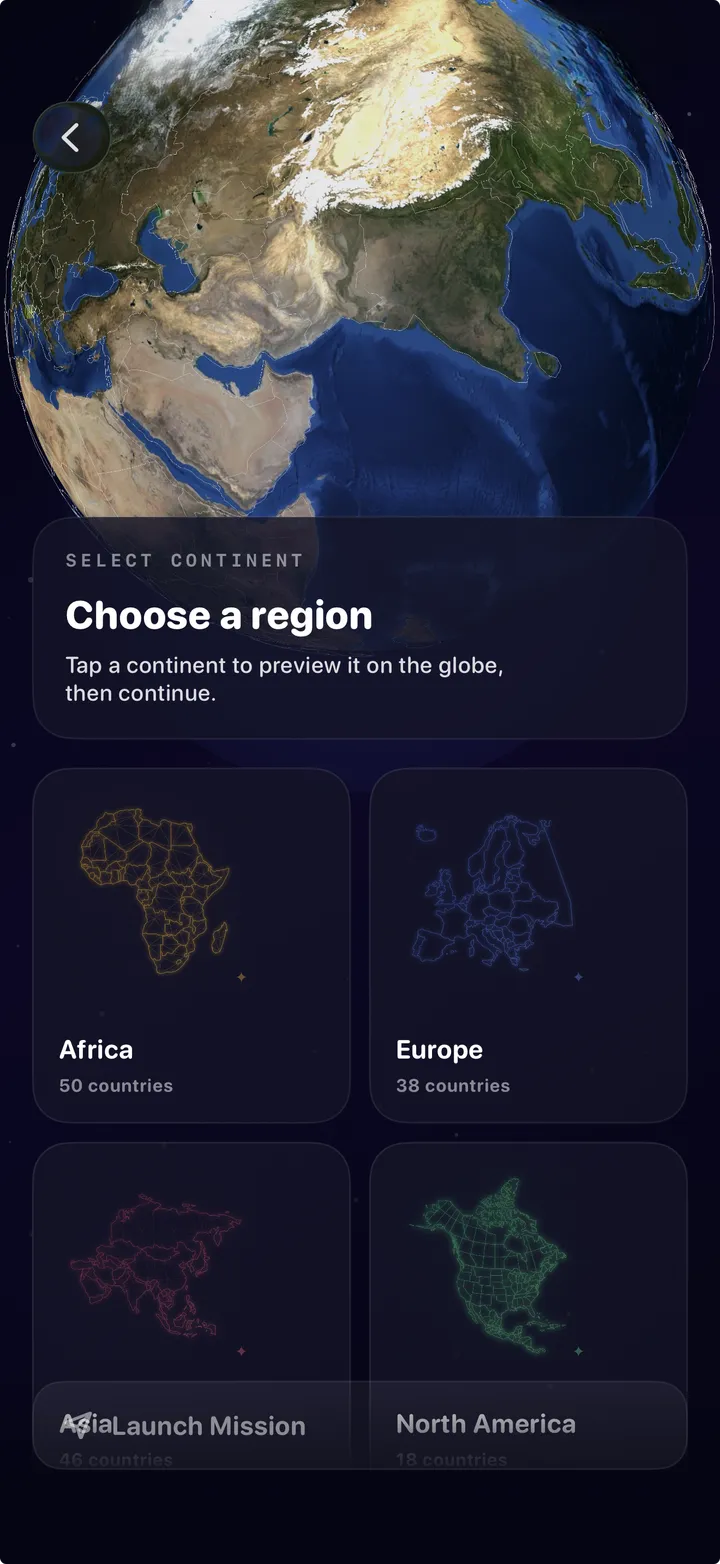
Step 1 — Capture clean source screens
Everything downstream inherits the quality of your raw captures, so this step is worth slowing down for. Use a real device or the iOS Simulator at the native resolution of your master device (the 6.9-inch iPhone for iOS, a 1080×1920-class phone for Android). Screenshots taken on an old test device at a smaller resolution will look soft after upscaling — there is no fixing that later.
- Fill the app with realistic, attractive demo data. Never lorem ipsum, never empty states, never “Test User 3.” Browsers read the content in your screenshots more than you'd expect — a finance app showing a sad $0.00 balance is telling a story you don't want told.
- Freeze the status bar. On the simulator,
xcrun simctl status_bar booted override --time 9:41 --batteryLevel 100gives you Apple's canonical 9:41 with a full battery. Inconsistent clocks and battery levels across a set are the fastest way to look amateur. - Turn off debug banners, notification permission prompts, and test overlays. A “DEBUG” ribbon in screenshot three has slipped through more reviews than you'd think.
- Capture more screens than you need. You'll cut down to the best 3–5 later, and the marginal cost of an extra capture now is zero. Re-opening the project to capture one missing screen in week three is much more expensive.
Across the screenshots people run through Storeshot, the single most common problem with uploaded source screens is empty or placeholder content — roughly one in five raw screens we see arrives with blank lists, default avatars, or obvious test data. The generator can restyle a screen; it can't invent your app's content.
Step 2 — Pick the right dimensions
Each store requires exact pixel sizes, and a single wrong dimension means the upload fails — App Store Connect rejects with a generic “invalid image” error that doesn't tell you what's wrong. For 2026 the masters are:
| Store · device | Portrait | Landscape |
|---|---|---|
| App Store · iPhone 6.9″ | 1260×2736 | 2736×1260 |
| App Store · iPad 13″ | 2064×2752 | 2752×2064 |
| Google Play · phone | 1080×1920 | 1920×1080 |
| Google Play · 10″ tablet | 1536×2048 | 2048×1536 |
Upload the 6.9-inch set and Apple scales it down for every smaller iPhone automatically; the 6.5-inch slot (1242×2688 or 1284×2778) only becomes required if you skip the 6.9-inch one. The full matrix — including the optional 6.3-inch class and legacy sizes — is in Apple's screenshot specifications and in our complete screenshot size guide. Google is looser: Play's requirements accept anything from 320px to 3840px with an aspect ratio between 16:9 and 9:16.
Step 3 — Write the headlines first
The biggest mistake is designing the layout before writing the copy. The headline is the thing people actually read, so write it first and design around it. Good screenshot headlines are short, benefit-led, and readable at thumbnail size.
| Weak | Stronger | Why |
|---|---|---|
| “Powerful habit tracking” | “Track 200+ habits” | Concrete outcome beats adjective |
| “Advanced statistics dashboard” | “See your streak at a glance” | User benefit, not feature name |
| “Sync, backup, export, share” | “Never lose a workout” | One idea per frame |
- Lead with the outcome. What does the user get, not what the app has.
- One idea per screenshot. Three features on one frame means none of them register.
- Keep it under ~6 words. Anything longer is unreadable in a phone search result. Test by viewing the frame at roughly 100×200 pixels — if you can't read the headline, neither can a browser scrolling search results.
- Make the set tell a sequence. Frame one is the hook, frames two and three the strongest features, the rest depth for people who swipe. Most won't — which is fine, because the first two do the work.
Step 4 — Compose the layout
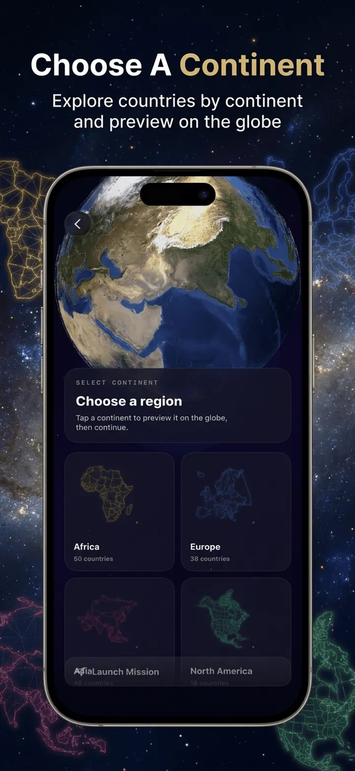
Now place your real screen inside a frame, add the headline, and choose a background. There are three layout families that cover almost every good listing you've seen:
- Device-in-frame: the screen sits inside a drawn phone on a colored background with the headline above or below. The default for a reason — it reads instantly as “this is the app.”
- Full-bleed UI: the screen fills the frame edge-to-edge with the headline overlaid. Bolder and more modern, but only works when the underlying UI has room for text.
- Panoramic sets: one composition flowing across two or three frames. Striking in a product page, invisible in search results — remember frames are also seen individually.
A few rules that consistently hold up regardless of family:
- Show the app, not a brand card. The first screenshot should show what the app does — not a logo splash. People scrolling past want evidence, not branding.
- Keep the device upright or at a slight tilt. Extreme 3D angles age badly and hide the UI you're trying to sell.
- Use a consistent palette across the set. A cohesive 3–5 image story looks far more professional than five unrelated designs. Pick two or three colors — ideally pulled from your app icon — and stick to them.
- Match typography to one scale. Same font, same headline size, same position on every frame. Consistency is what separates “designed” from “assembled.”
Step 5 — Export at exact size and upload
Export each frame as PNG or high-quality JPEG, in RGB, with no alpha channel — App Store Connect rejects transparency — under 8 MB, at the exact pixel dimensions for the device class. Then upload:
- App Store Connect: open your version page and use the media manager (“View All Sizes in Media Manager”) to find the right device slot. If your upload is rejected with a generic error, check dimensions first — even one pixel off fails silently.
- Play Console: Store presence → Main store listing. Phone screenshots are required (minimum 2, maximum 8); tablet sets are required for tablet visibility.
- Preview on an actual phone before submitting. A layout that looks great at 100% on a 27-inch monitor often falls apart at thumbnail scale.
What 550+ generated screenshots taught us
Watching real screens flow through Storeshot has made a few patterns impossible to ignore:
- Source quality is the ceiling. The best-performing generations start from crisp, content-rich captures. Blurry or empty source screens produce polished-looking frames that still fail, because the app itself looks lifeless.
- Most apps need fewer frames than they think. Sets of 4–6 deliberate screenshots consistently look stronger than the maximum 10 — padding a set with settings screens and edge-case features dilutes the story.
- Landscape is almost always the wrong default. Portrait is what search results display; landscape only earns its place for games and video apps whose actual experience is landscape.
- Dimension errors are universal. Before we hard-coded exact export sizes, mis-sized uploads were the most common failure we heard about. It's why Storeshot exports at the exact master dimensions and won't produce anything else.
Tools: hand-built vs. templates vs. AI
| Approach | Good for | Cost |
|---|---|---|
| Figma / Sketch by hand | Total control, custom brand systems | Hours per set; you maintain dimension specs yourself |
| Template tools | Quick device frames, drag-and-drop | Fast but generic — your listing looks like everyone else's |
| AI generators (Storeshot) | Cohesive designed sets from raw screens, exact export sizes | Seconds per set; less pixel-level control than Figma |
Honest take, since I build one of these: if you have a designer and a brand system, Figma gives you the most control and you should use it. The AI route earns its place when you're a developer without design hours, when you need a cohesive set today, or when you're localizing the same set into several languages and hand-rebuilding each one isn't realistic.
Don't skip localization and testing
Two things separate listings that plateau from listings that keep improving. First, localized screenshot copy — translated headlines, not just a translated description — is consistently one of the biggest conversion wins in international markets. Second, A/B testing: Apple's Product Page Optimization and Google's store listing experiments both let you test screenshot sets against each other with real traffic. Pick one hypothesis at a time — “benefits-first beats features-first” — and let the data decide. The full measurement-and-testing loop is covered in our screenshot optimization guide.
Pre-submission checklist
- Exact pixel dimensions for the device class (one pixel off = silent failure)
- PNG or JPEG, RGB, no alpha channel, under 8 MB
- Status bar consistent across the set (9:41, full battery)
- Realistic demo content — no empty states, no test data
- Headline readable at ~100×200px thumbnail size
- Strongest screen + headline in position one
- Consistent palette and typography across all frames
- Checked on a real phone, not just a desktop preview
The fast way
Doing all five steps by hand in Figma or Photoshop takes hours per language and breaks every time Apple changes a dimension. An AI app store screenshot generator collapses steps 3–5: you drop in raw screens, it drafts headlines, composes a cohesive set with a planned palette and typography, and exports every image at the correct size for the store and device you picked.
Make your screenshots in one pass
Drop in raw screenshots, pick App Store or Play Store, and Storeshot generates a cohesive, store-ready set at the correct dimensions. Your first two are free — no signup.
Generate screenshots →Last updated June 2026.